Good morning!
If Emma Chamberlain’s viral home tour made you feel conflicted last week, I have a few ideas about why. And if you’re someone who enjoys decorating but finds the current state of interiors a little hollow and depressing, I have a suggestion.
(Substack tells me this newsletter has too many photos to fit in an email, so you may have to click into the web browser to view them all.)
Deeply personal homes
Last Wednesday, when Architectural Digest dropped YouTuber Emma Chamberlain’s home tour, Avi immediately texted me the link, which I forwarded to Harling, who’d already seen it, and then Michelle, who’d also already seen it. The photos were blowing up on Instagram, Twitter, TikTok. Within hours the tour seemed fated to join the canon of widely beloved AD-featured homes, alongside Dakota Johnson, Kendall Jenner, and Troye Sivan. Her house checked all the boxes—the wood beams and glass ceilings; the Instagram-approved mix of Scandi, Japanese, and retro-American references; the organic shapes and textures; the whimsical details. It seemed decorated specifically to solicit the envious gaze of trend-aware onlookers (while being, of course, too expensive to imitate). With the exception of a $30,000 dollar chain-link chandelier I couldn’t comprehend, I thought it looked pretty great.
Followers of the 21-year-old Emma Chamberlain (me) know this tour is an “unveiling” of her new house, which she bought last year for $4M+ dollars and has been renovating ever since. Followers also know that Emma has been living out of a suitcase for months, traveling around Europe, which means she hasn’t actually lived in the house yet, or if she has, only fleetingly. It looks that way, too: Everything is brand new, placed just so. She’s never used the bath, she admits, and scolds herself for touching something too casually, as if her house were a museum and security’s eyes were on her. There are only a couple signs that a human being dwells there (a podcasting mic, a sketchbook with pencils sprinkled around it) and even those suggest a stage director’s touch. In a headline, Arch Digest dubbed the home “deeply personal.” The designers she worked with describe the immaculately designed space as “not a perfect house” but “the imperfections only add to the narrative we developed with Emma.”
(I would include photos but they’re copyrighted—see them here!)
My mind went one place. After months of hearing the outrageous prices my sister was quoted for modest upgrades to her Denver bungalow ($25,000 dollars to have her walls painted white; $15,000 dollars for two small built-in book cases; $4,000 to have a single armchair reupholstered), all I could think about while watching the AD tour was how much money Emma must have spent on the redesign. Millions, surely. Most strikingly, everything seems to have been purchased at once—the massive rugs, the wall-sized slabs of precious marble, the colorful custom tiling, the stacks of designer tables and chairs and couches and light fixtures. All of it to reflect her tastes from a one-year period, ages 20 to 21. I like the end result, full disclosure. She has a good three years before it looks dated or she changes into a completely different person.
“It makes me kind of…ill?” my friend Michelle, a fellow Emma fan, texted me about the tour. It gave me a stomach ache, too. I imagined being Emma, walking around my brand-new five-bedroom, seven-bathroom house, where I lived by myself, so young, and the only emotion I could summon was guilt. (Okay, guilt mixed with euphoria.) This is my own neurosis; I was recalling my moral crisis from when I worked at Man Repeller, encumbered with free swag I didn’t need—how I felt haunted almost, by my waning inability to be grateful for it, or even excited by it. It was too much, too fast. I have no idea if Emma feels any of that abundance-related guilt, and it’s not really my place to suggest she should. In the tradition of celebrity gossip, I’m merely projecting.
“Wait,” Michelle continued, with her own projection: “so she’s just been literally living out of a suitcase in Europe and…renovating a hotel? And then she invites people over and she’s like…I live here, don’t be mad at me?” This made me laugh (it does look like a hotel, a very cool hotel), and I knew what she meant. If I lived in a place like that, I’d be scared to show my friends, too.
This isn’t really about Emma though, whom I genuinely enjoy and root for despite disagreeing with fans’ impassioned proclamations, in every comment section about the tour, that she “deserves it” (does anyone?). She’s just one in a long list of people who have entire rooms in their homes that they never enter because they’re good at garnering attention online. This essay is more about what Architectural Digest meant when they called her house “deeply personal,” and what kind of world would uncritically accept that description. Sure, she bought some tchotchkes on Etsy and hung some of her dad’s paintings, but what she really did is express her latest consumer tastes with the help of paid professionals. Her taste is sophisticated for her age, absolutely, but her home is personal because a “narrative” was “developed” by her team for a fee.
Most published home tours are, like Emma’s, an “unveiling” of a public figure’s recently-purchased home, fully redesigned and decorated in secret until exclusive, splashy coverage is secured. Molly Baz did the same thing for Domino last month. In May, Ashley Tisdale made headlines for making her husband “buy 400 books to fill shelves” for her own Arch Digest tour. I understand the urge to spruce up your place for a photoshoot; I’ve done it many times. But when taken to this extreme—an approach that’s trickled down to the average influencer—I’d argue it subverts the true appeal of a home tour, which is to see how someone actually lives. The producers behind these videos must understand this on some level, because they tend not to focus on the apparent newness of the homes they feature, instead asking the subjects to tell personal stories as they wander through their arid spaces.
The question of what actually makes a home personal puzzled me when I moved into my apartment last year. I wanted to be intentional this time, which apparently meant decorating it in the vein of the spaces I’d bookmarked on my phone, like living showrooms, scrubbed of plebian household items like trash cans and cords, every choice considered, every corner curated within an inch of its life. I wrote about that temporary break from reality here. Later, I found a much better answer to my question in an old coffee table book I’ve had laying around my house for years—a graduation gift from my cousins in 2011. Called The Selby Is In Your Place, it’s a very Tumblr-era photobook of real people’s interiors by photographer Todd Selby. I hadn’t leafed through it in years, but when I finally did, I realized I’d been thinking about “decorating” all wrong.
The people featured in the book are mostly Gen-X hipsters—artists, writers, musicians—which is to say they aren’t necessarily anti-consumerist or uninterested in showing off. In fact, in the introduction, Lesley Arfin (whose apartment is in the book) writes that envy for other people’s homes, and a desire to spark envy in others, is a thread that binds New Yorkers together. But she goes on to say that Selby managed to make this book feel more curious, personal, and celebratory than braggadocious. “Looking through these images, you might find yourself feeling just a little more intimate with a person you’ve never met, and might never meet,” she writes.
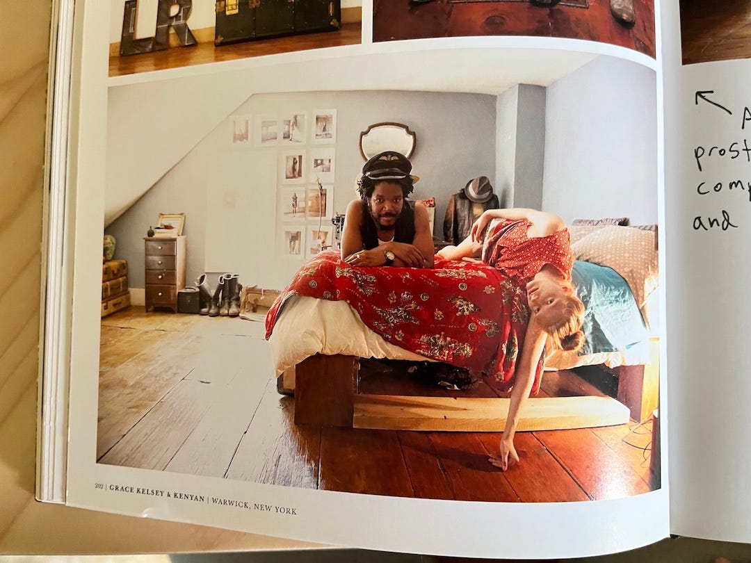
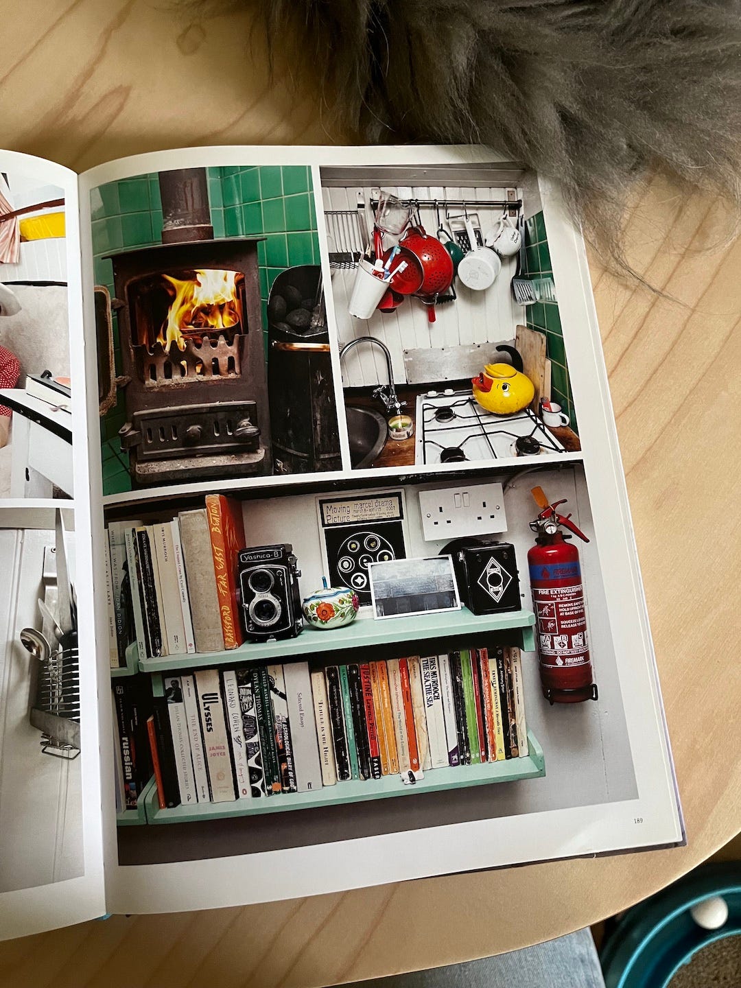
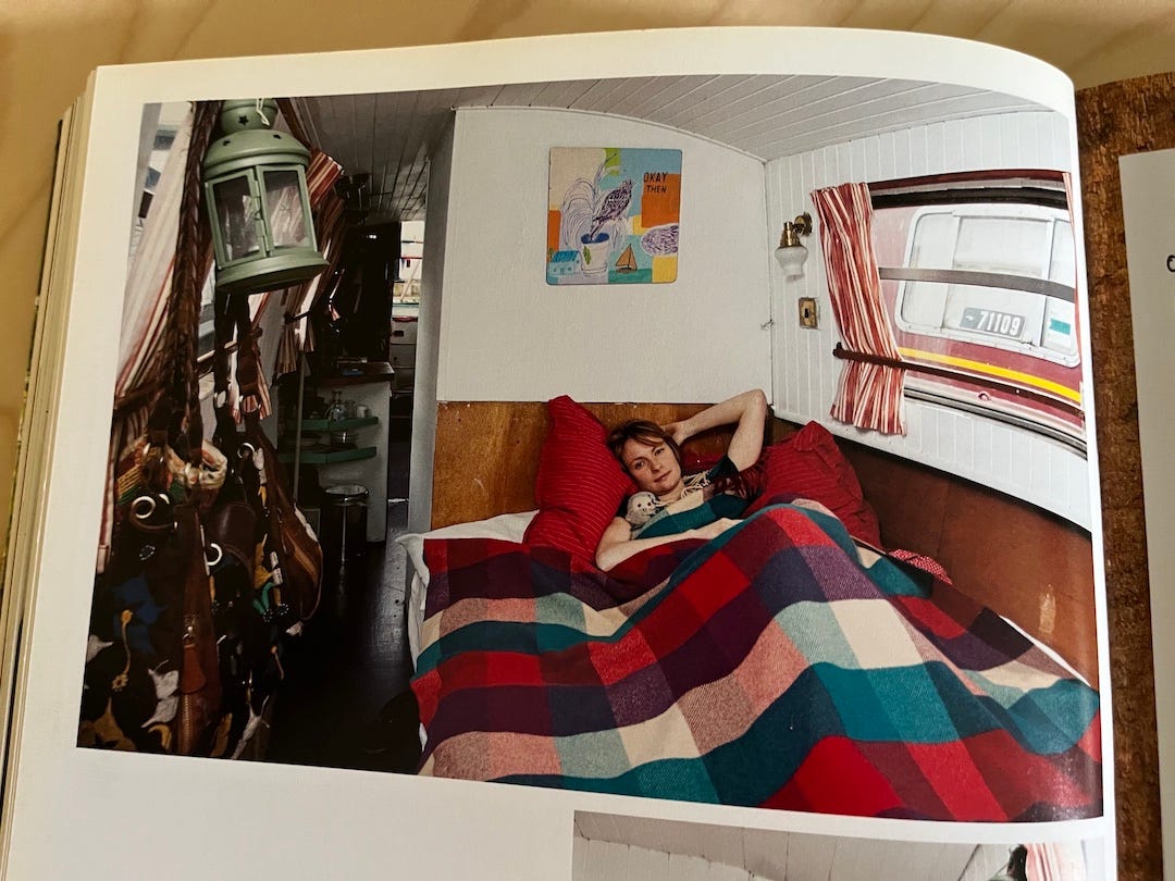
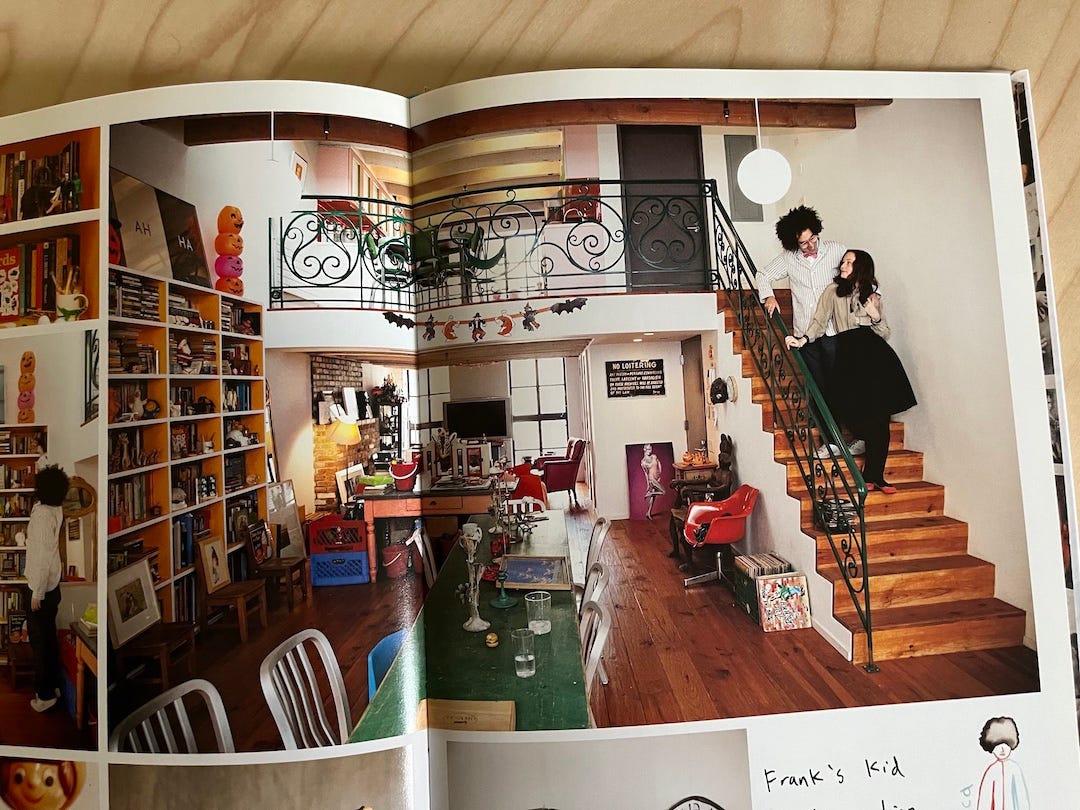
I’m sure Selby deserves credit for this, but something else does too: They were shot before the launch of Instagram. Most of the homes featured are a little junky and lived in. With the exception of a few, none play by a specific set of design rules. No one seemed to go shopping in the same place, or work off the same mood board, or work off a mood board at all. A leather couch covered in sharpie, papers pinned to walls, mismatched sheets, chipped dishes, cardboard boxes full of books next to beautiful antique lamps. Certainly a little sleaziness was in style at the time (the book was published in 2010), but rather than a product of trends, these homes feel personal, layered, seasoned with life itself. They look like they came together over a mishmash of years, experiences, and influences, without obvious windfalls of cash. A handful of magazines, like Apartamento and Nest, have been known to feature places like that, often the homes of lesser-known artists and creatives, but the big-budget influencer and celebrity home tours are the ones racking up the views these days, and setting the cultural tone.
In revisiting the book, I realized the missing ingredient in the current conception of a great or cool place is time. When I realized my apartment would come together over years, that it didn’t need a mood board, that it didn’t need to present itself to others like a designer’s statement—and that in fact those things could sap my home of its humanity—I felt liberated. It made decorating actually sound fun again. Like something anyone could do, and for no other reason beyond their own enjoyment.
In Journal of a Solitude, a book I recently read (and loved) by the poet May Sarton, she wrote about the hollowness of the perfectly curated home of the early ’70s: “[S]tandards of housekeeping and house-decorating have become pretentious and competitive. I don’t blame children for fleeing those House Beautiful houses, nonshelters, dehumanized, ostentatious, rarely expressing an individual family’s way of life. … A house that does not have one worn, comfy chair in it is soulless. It all comes back to the fact that we're not asked to be perfect, only human. What a relief it is to walk into a human house!”
Emma Chamberlain’s house felt a little cold for someone so famous for being warm. I’m sure that will change with time, and that she’ll be fine. Our response is the part that’s interesting. You can tell a lot about a society by what we consider aspirational. So, in a nod to what Sarton calls “human houses,” I want to leave you with some photos from The Selby Is In Your Place. Whether or not these homes are your particular style (they’re not mine, and that’s the point), maybe you’ll find their humanity as appealing and inspiring as I do. It’s fun to look at celebrities’ perfectly curated homes, and even pleasant to imagine living in them, but when I consider what gives my life real texture and meaning, these photos offer a more compelling spiritual blueprint.
My favorite article I read last week was “Stone Skipping Is a Lost Art. Kurt Steiner Wants the World to Find It,” an amazing and poignant profile by Sean Williams for Outside Magazine. Last Friday’s 15 Things also included a beautiful essay about motherhood (or lack thereof), a shocking vegetable revelation, lots of recommendations for the perfect moody fall album (I think I may have found the one), and more.
I hope you have a nice rest of your week!
Haley


